College students today juggle an overwhelming number of responsibilities, like academic deadlines, part-time jobs, social commitments, and personal goals, often leaving them feeling stressed and disorganized. While numerous productivity tools exist, many feel too rigid, overwhelming, or lack the motivational elements needed to sustain long-term engagement. Orbital was conceived as a response to these pain points, reimagining task management as a playful, human-centered experience that adapts to how students actually work. By integrating gamification with flexible organization features, the platform transforms task tracking from a chore into an engaging journey that helps students balance their work, life, and personal needs while staying motivated through visual progress and satisfying feedback.
Orbital
A daily task tracker web application to help college students properly organize their tasks
Introduction
Research
Target Audience
- College students
- Ages 18-25
- Those who find traditional productivity tools too rigid or uninspiring and struggle with focus, motivation, or procrastination in high-distraction environments
- Users who value a more human-centered, gamified approach to time management that promotes balance, motivation, and sustained attention
Problem Statement
Gen Z's are stressed and struggle with keeping track of their daily tasks due to existing services that do not allow them to organize their tasks in a comprehensible manner and lacking features to allow students to stay motivated.
User Research
User Interview Key Insights
- During the development of Orbital, we conducted interviews with twelve users from various backgrounds including UI/UX design, human development, informatics, English, and animal science to better understand their time management habits, preferred task tools, and pain points with existing productivity systems.
- Motivation was tied to visualization and progress tracking, whether through calendar color-coding, disappearing completed tasks, or physical tools like planners and whiteboards. Users expressed frustration when apps lacked satisfying feedback or customizable prioritization.
- There was a divide between preference for customization and need for simplicity: users wanted flexible tools, but excessive complexity or rigid design discouraged consistent use. They valued progressive disclosure, revealing complexity only when needed.
- The top desire was an intuitive, aesthetically pleasant, and centralized system that merges reminders with flexible task notes, provides visual structure (like color or subtask organization), and supports self-regulation without overwhelming notifications.
- Opportunity: Orbital can stand out by balancing simplicity with optional depth, helping users structure their time without cognitive overload, especially during high-pressure periods like exams, work deadlines, or creative sprints.
User Persona
.png)
Isabel Mercado
Student
“I easily forget things and love to organize my planner with little cute things”
- Isabel is a 4th Year Sociology Student at the University of California, Irvine. With all of these responsibilities and school, she struggles with tracking her tasks, neglecting what she needs to get done.
- Due to her forgetful nature, she wants to be more organized with all her different priorities in life. Additionally, she's very on the go, so she would like an app to quickly jot down tasks that need to be completed for the day.
- She would like it to be customizable to them, prioritize stuff that needs to be done immediately, and be easy to use and efficient for jotting down quick tasks that need to be done for the day.
- I have this uncertainty issue towards decision-making. I always need a proof or trustworthy person to believe a theory or a statement.
Competitive Analysis
 1.png)
Notion
Pros
- Highly customizable, Supports embedded calendars/lists and external integrations
Cons
- Lacks a system to motivate users, Collaborative features are limited to shared workspaces, Difficult learning curve
 1.png)
Ticktick
Pros
- Well-rounded system with intuitive interface, Integrates task lists, calendar, habit tracker, and Pomodoro timer
Cons
- Advanced customization features locked behind a premium subscription
 1.png)
Todoist
Pros
- Integration with calendars and external apps, Customizable priorities
Cons
- Relies heavily on user-defined priorities, Lacks engaging rewards
Wireframes
Low-Fidelity Design
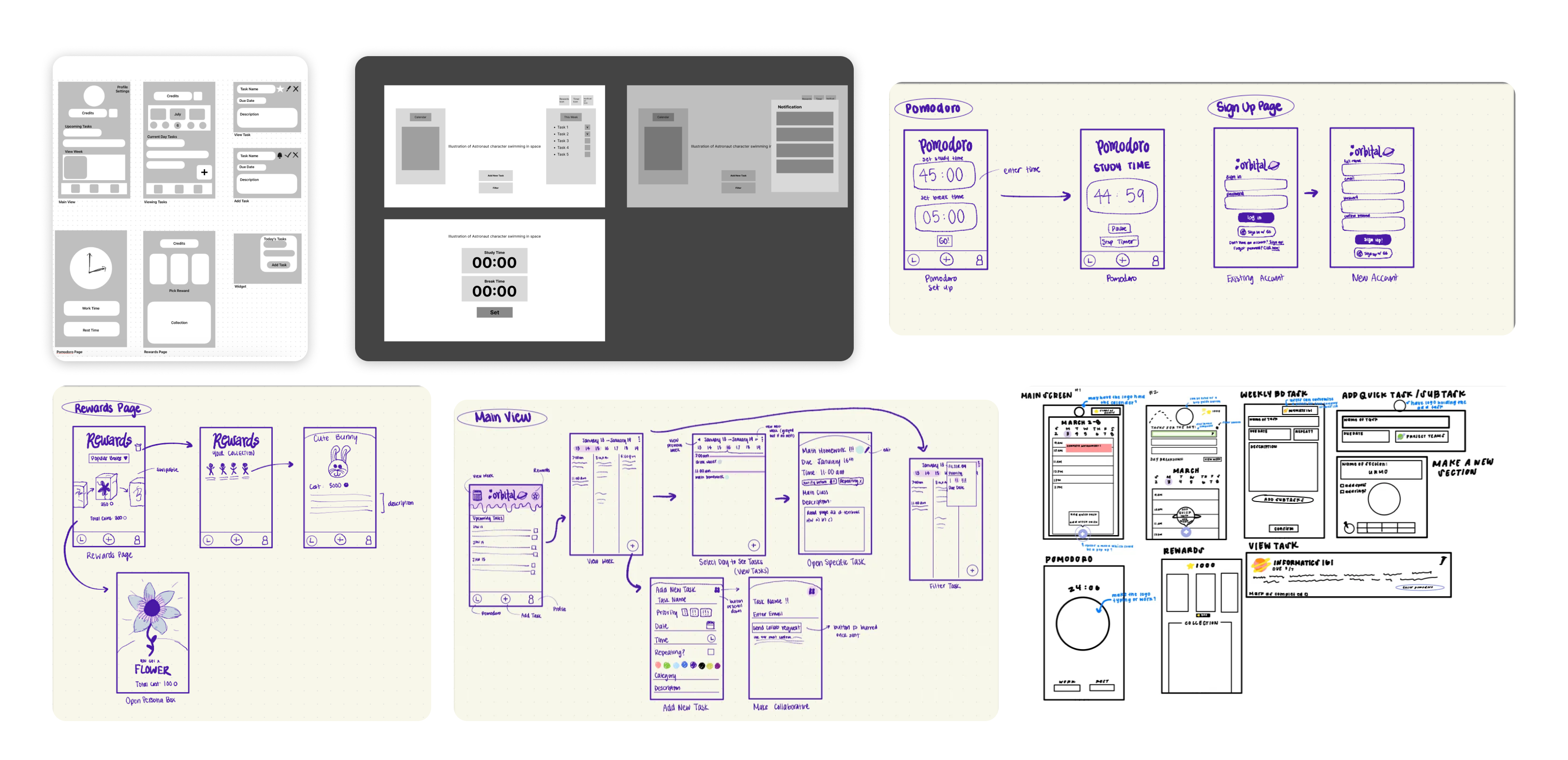
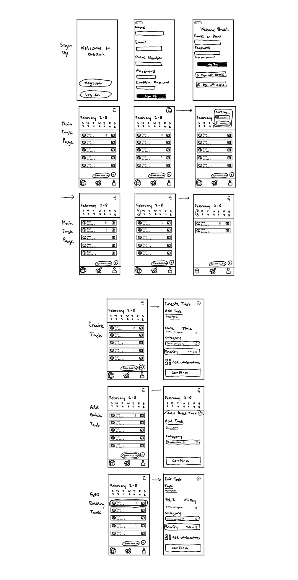
Exploring Features, Flow, and Data Use
- We mapped out key flows for users to track tasks, set Pomodoro timers, and earn in-app rewards as motivational feedback. Sketches focused on supporting flexibility for quick task creation, while also offering detailed settings like priority, categories, repetition, and collaborators.
- The design emphasizes modularity and progressive disclosure with basic functions (e.g., adding a quick task or viewing today's schedule) are surfaced first, while deeper customization (e.g., editing due dates, collaborating, or filtering tasks) is nested within intuitive icon-based menus.
- A coin-based rewards system was prototyped to gamify productivity. We introduced visual "reward boxes" and collectible items as incentives to encourage habit-forming behaviors over time.
Interface Drafting and Navigation
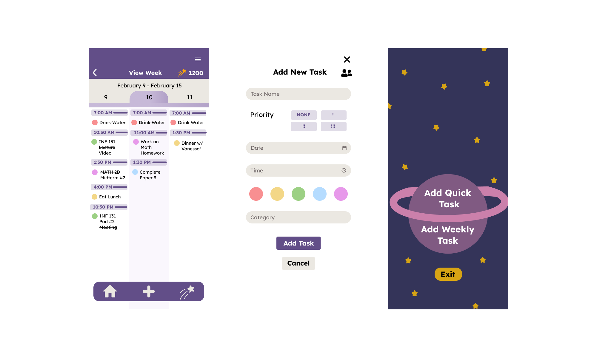
- We developed multiple layout variations to explore how users might interact with their task lists, Pomodoro session tracking, and a calendar-based overview. The week-view calendar with task blocks allows for clear visual prioritization and breakdown.
- Navigation flows were unified across all designs with a persistent bottom nav bar for Home, Pomodoro, Add Task, Rewards, and Profile. This ensures fast access to core functions while minimizing decision fatigue.
- Filtering tools, collaborator inputs, and repeat task settings were integrated in the task creation flow to reflect real user needs gathered from interviews, particularly the demand for clear organization and just-in-time motivation without overwhelming complexity.
Style Guides
.png)
.png)
.png)
As Orbital aims to make productivity feel playful, personal, and rewarding, our visual design language was crafted to inspire joy, focus, and a sense of light-hearted momentum. Whether a user is cramming for finals or simply organizing their week, Orbital wants to feel like a friendly companion rather than another rigid to-do list.
Images
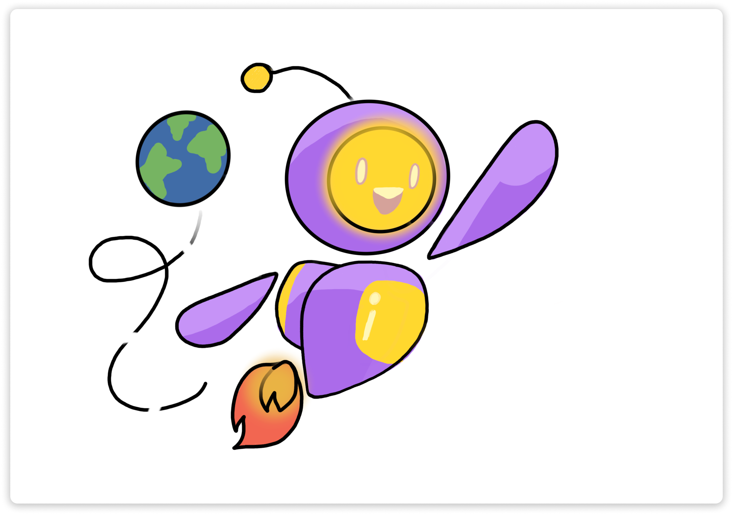
- We designed a mascot-based system that represents Orbi, a cheerful space explorer whose journey mirrors the user's own task-completion arc. These illustrations, ranging from Orbi flying past Earth to transforming into cute dessert-themed collectibles, help inject a narrative of progress and delight into the everyday grind.
Font
- We paired SuperFrog and Lexend to strike a balance between personality and legibility. SuperFrog injects an expressive, bouncy tone perfect for titles, headers, or playful microcopy. Lexend provides cognitive ease and smooth readability across dense task lists or calendar breakdowns. The pairing supports Orbital's mission: making productivity less overwhelming and more human.
High-Fidelity Design
Usability Testing
What Worked Well
- Users appreciated Orbital's ease of use, noting that core navigation felt natural and not overwhelming.
- The collection and blind box reward system was particularly well-received, with testers describing it as "fun" and "motivating," reinforcing our hypothesis that gamification could improve user engagement.
Areas for Improvement
- Several testers felt the blind box mechanic was confusing, so they weren't sure how to earn or use rewards effectively.
- Users wanted the ability to check off tasks as completed, and expressed frustration when they couldn't clearly track their progress.
- The home screen felt visually cluttered, making it harder to quickly grasp task priorities.
Changes Based on Feedback
- We added a short onboarding tutorial to walk users through the reward system and interface on first launch.
- We introduced checkboxes next to each task for satisfying visual completion and better user control.
- The blind box system is now integrated with the points system, making it clear how users earn rewards and when they can redeem them—tying productivity directly to progress.
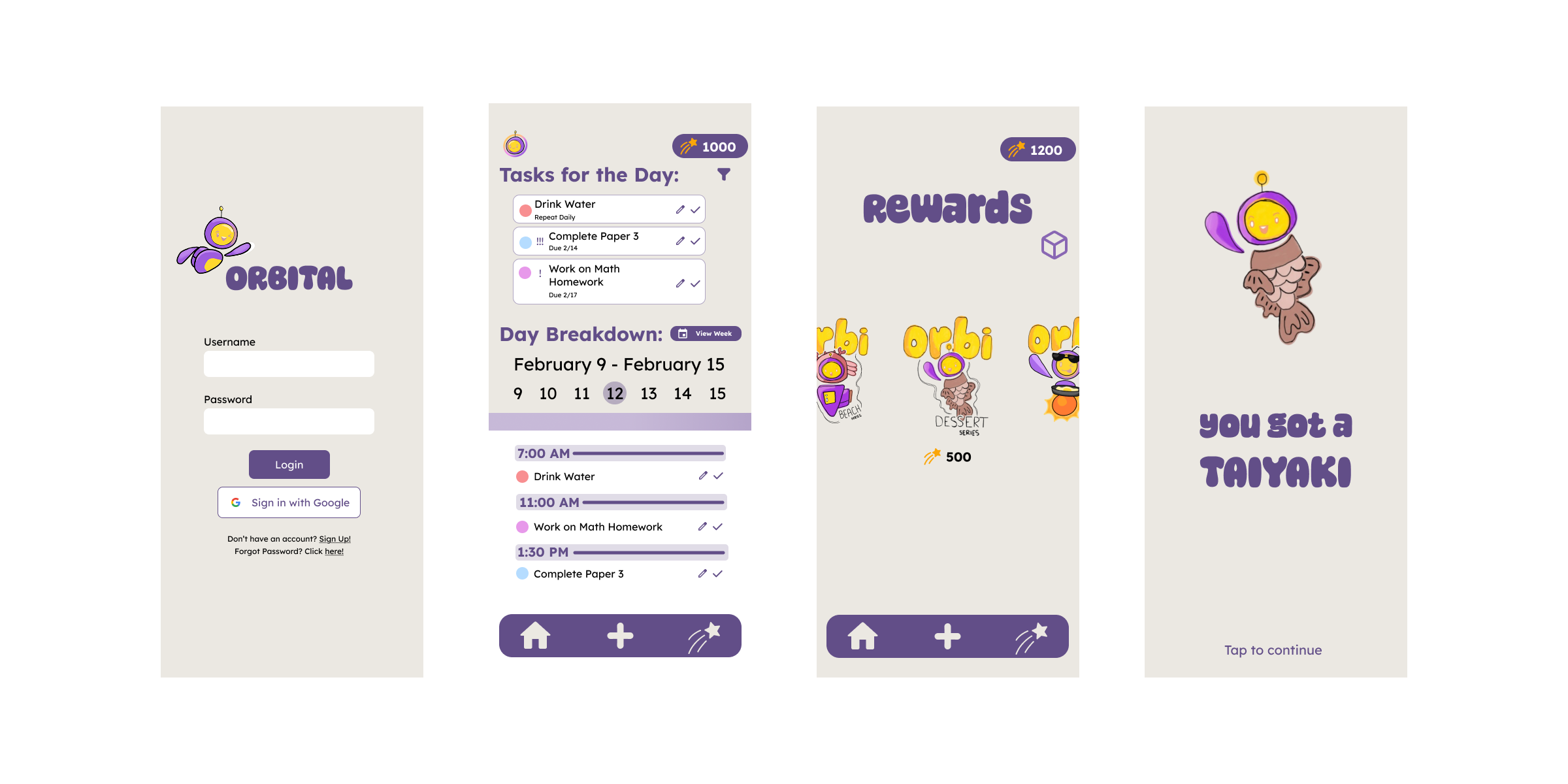
Final Product
The final product is a clean, intuitive web application that helps students manage their daily tasks and build productive habits. The design was refined through user feedback and usability testing.
Reflection & Next Steps
After completing the final version of Orbital, we took a moment to reflect on both the successes of our design process and the areas that still hold room for growth. From early ideation to polished handoff, the journey reaffirmed our focus on building a product that blends productivity with warmth and play.
What Went Well
- We received encouraging feedback, including quotes like "What a cute app!" from potential users, validating our approach to visual design and emotional tone.
- Our team maintained a clear understanding of the problem space and target audience, ensuring that user needs shaped every stage of development.
- The transition from sketches and mid-fidelity wireframes to high-fidelity designs was smooth and aligned well with our initial vision.
- Usability testing results were mainly positive, especially in response to features like gamified rewards and clean navigation.
- Our efforts in branding created a memorable and consistent personality for the app that resonated with testers.
What Could Be Improved
- Some users noted that the art style lacked consistency, and illustrations could be further polished to enhance overall visual cohesion.
- The color scheme did not fully support the calming, motivational mood we aimed to create—this is something we'd refine in future iterations.
- From a UI standpoint, certain font and layout choices affected readability and flow across the app, especially on longer task views.
- While the cartoon mascot helped create an inviting tone, the style may skew a bit young, and could be adjusted to better appeal to a broader millennial user base.